Modern product design isn’t one-size-fits-all. Whether adjusting for different brands, user segments, or personal preferences, flexibility matters. To support this, I explored a themeable design system in Figma using variables and modes. This allowed the same components to change in tone, color, and shape without duplication, making the system both scalable and expressive.
Structuring the system with semantics in mind
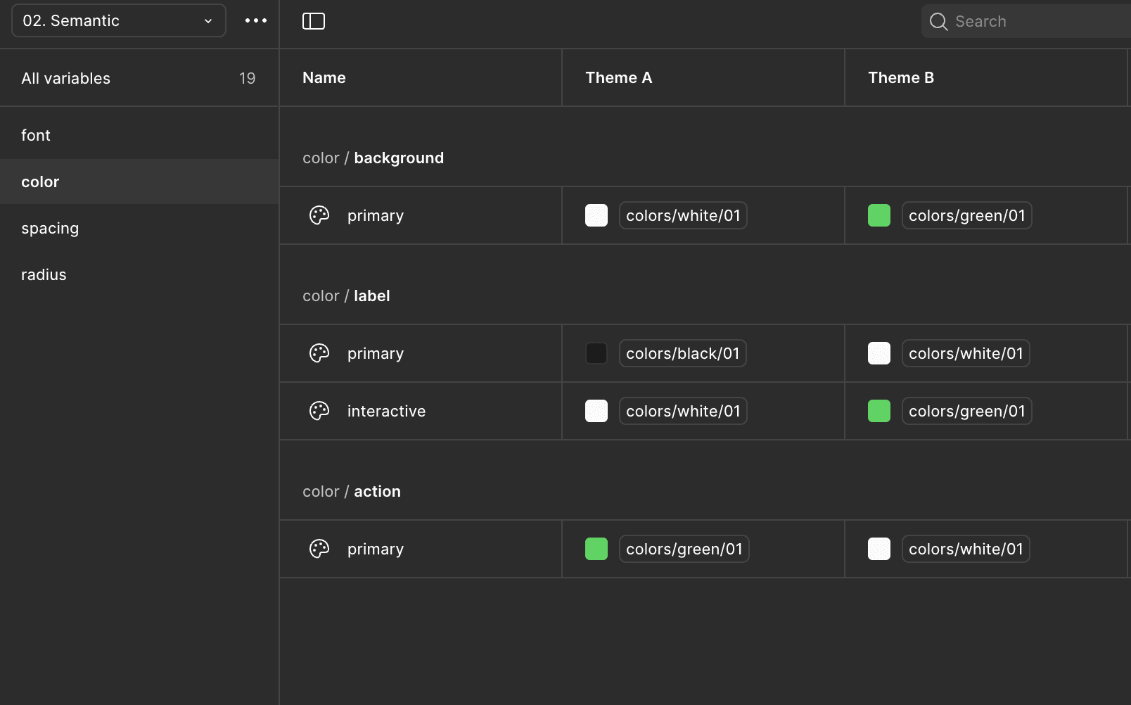
At the core of the system is a three-tier token architecture built for clarity and flexibility:
Primitive Tokens – Raw values like #00684A, 16px, or 4.
Semantic Tokens – Abstracted values that describe intent, such as color-primary, radius-base, or spacing-sm.
Component Specific Tokens – Tokens tied to specific UI elements, like button-bg or card-padding-horizontal.
Instead of baking brand identity directly into token names (e.g. brandName-green), I use names that reflect role and purpose. For example, color-primary is mapped to different values depending on the selected theme enabling the same component to express different tones without rewriting or duplicating logic.
Designing with multiple themes
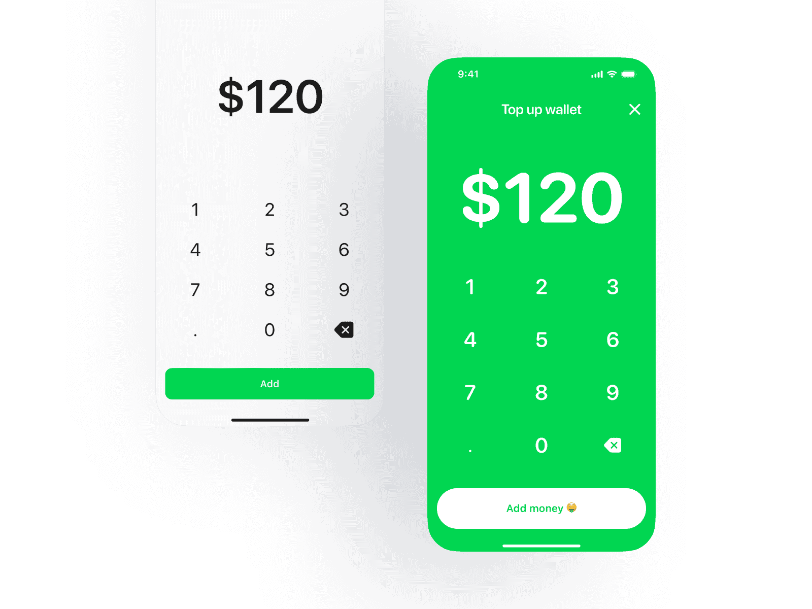
To show how semantic tokens unlock flexible theming, I set up an example using two distinct visual directions:
A neutral theme with soft, minimal visuals.
A bold theme with vibrant, expressive UI choices.
Both themes use the same component library, nothing is duplicated but the end experience feels completely different. Using Figma variables and modes switching, these tokens dynamically adjust to match the selected theme.
And it’s not just color but radius, spacing, font family, type scale, even tone of voice can adapt across themes. That’s what makes the system feel expressive without compromising consistency.
Final note
This setup isn’t just about how the product looks, it’s about creating a shared structure that design and engineering can rely on. By using variables and semantic tokens in Figma, aligned with the codebase, we make it easier to stay consistent, scale efficiently, and adapt the experience when needed.
Whether the product needs to support different themes, brands, or tones, the foundation remains solid and the system stays flexible.